A Lighter Color Inside the Cabinets Than on the Doors
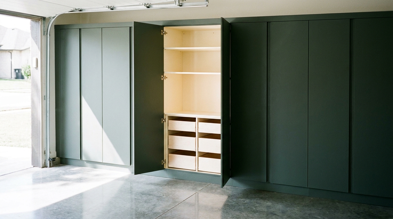
A finished cabinet run looks settled from across the garage because the doors carry the color of the room. The second color is the one you meet when a door swings open, and we make that interior laminate lighter than the door face so the box looks bright and still belongs to the same run. On opaque doors, a 2019 architectural casework standard treats that interior as its own surface: one consistent color through the project, matched to the outside only if the specification says so [1]. The lightness is a design choice we make with you, not a second finish fighting the first.
The door is the room, the interior is the reveal
In a Charlotte garage the doors do the public work. Pewter, charcoal, a warm wood grain, navy: that is the plane you see with the bay door up or down. Our garage cabinets are heat-fused laminated melamine, with a finish library from metal and wood patterns to solid colors, White and Antique White at the light end and Charcoal, Black, Navy, and Cobalt Blue at the deep end. The interior is not asked to repeat the door. It is asked to look composed beside it.
We decide the pair together. A deep door with a deep box can look heavy the moment it opens. A deep door with a lighter interior does the opposite. The face stays the finish you chose for the wall, and the same lighter interior in every cabinet keeps the open doors looking like one piece of work. Cabinets you can see into without opening a door are a different case, covered below. Fixture layout is a different choice too. This article is the color inside the box versus the color on the door face.
What "inside" means once the door moves
Casework standards sort surfaces by when a person can see them. The Architectural Woodwork Institute's glossary describes a semi-exposed surface as one that is generally not visible until a component moves, and it gives the example of opening an opaque cabinet door [2]. ANSI/AWI 1232-2022 lists the parts: the inside of the ends, the back, and the bottom, the shelves, and the drawer box, including sides, subfront, back, and bottom [3].
ANSI/AWI 0641-2019 then says what color those surfaces owe the rest of the cabinet. Semi-exposed surfaces require a consistent color, or a consistent species, through the entire project. Matching the exposed face is required only if the documents say so [1]. For decorative laminate, that semi-exposed interior is thermally fused laminate or high-pressure decorative laminate, at the manufacturer's option [1]. Read together, the 2019 and 2022 standards allow an opaque-door cabinet to wear one color on the face and a different, deliberately chosen color inside, provided the inside color does not wander from cabinet to cabinet.
There is a second category, and it points the other way. Exposed interior surfaces are the ones on view in open casework or behind a transparent door [3]. At both premium and custom grades, ANSI/AWI 0641-2019 asks those always-visible interiors, other than the door and drawer-front backs, to be laminate compatible with the exposed exterior in color, grain, and pattern [1]. Where the interior face of a door is itself an exposed interior surface, premium grade calls for the same material, color, pattern, and thickness as the face. Custom grade allows that interior face to match either the interior or the face [1].
We build opaque doors. The interior you meet is the semi-exposed kind. We specify it lighter than the door, and we carry that lighter laminate onto the back of the door and the drawer box so the open cavity is one field, not a light box framed by a dark door back. We do not describe that choice as the premium-grade rule for a door back that stays on view. Open shelving or a clear door follows the stricter compatibility rule, and we say so in the design before anything is ordered.
If a project cites the 2019 standard and names no other finish, the default product list includes white decorative laminate, thermally fused or high-pressure, or an unfinished closed-grain hardwood meant for an opaque finish [1]. A white interior is the ordinary unspecified baseline in that document. A charcoal, navy, or dark wood door is something someone adds. The interior does not have to follow it unless the specification says so.
Lightness is why the open box looks bright
Lightness has a plain scale. NIST's OSAC lexicon, added January 15, 2025, and drawn from ASTM E1732 (2025), defines Munsell value as the lightness of a color, from 0 for pure black to 10 for pure white [4]. A lighter interior sits higher on that scale than the door. We are not assigning our finishes a Munsell number here. The interior is the lighter of the two colors, except when the door is already light and there is nowhere useful to go above it.
How much light a surface sends back has its own name. BS 8493, the British method of test published in 2008 and amended in 2010, defines light reflectance value as the proportion of visible light reflected by a surface, compared with the sensitivity of the human eye [5]. The same page notes that a greater difference in that value between two visually adjacent surfaces is more likely to be identified [5]. That note comes from accessibility guidance for buildings, and we are not treating a cabinet interior as a stair or a door handle. We are using the definition. With the door open, the face and the box are visually adjacent. A lighter interior reflects a larger share of the visible light that reaches it than a deep door color does, so the cavity reads as bright against the door.
A 2025 indoor workplace lighting standard, ISO/CIE 8995-1, makes a related point and then limits it. The CIE's description says visibility depends on how light is delivered, on the color characteristics of the light source and of the surfaces, and on glare, and that improving the contrast of what a person is looking at can help without raising the illuminance [6]. The same description says the standard does not recommend an atmosphere or an aesthetic created by lighting [6]. We take that limit seriously. It is not a style guide for cabinet color. It does say surface color is part of whether the inside of a box is easy to see, which is why we choose the surface, not a fixture layout, in this decision.
Sheen is not lightness. The institute defines sheen as the shine of a cured finish, traditionally read with a 60-degree gloss meter, and notes that finish makers do not share one set of names for those levels [2]. A light color can be quiet in sheen. A dark color can be shiny. We do not treat "lighter interior" as "glossier interior."
Garages also do not have one light. The glossary defines metamerism as an apparent change in color caused by varying lighting conditions [2]. A chip that looked right under a showroom lamp can shift on a Charlotte wall, with daylight at the bay door and a different light deeper in the bay. We compare the door finish and the interior finish in the garage, not from a name on a list alone.
The color lives in the laminate, not in a coat of paint
Our cabinets use heat-fused laminated melamine. In architectural woodwork language, "melamine" points to a thermally fused decorative laminate panel [2]. The Composite Panel Association's voluntary standard CPA 5-25, issued May 1, 2025, defines that material for the North American market. Thermally fused laminate is made by using a hot press to permanently fuse one or more resin-impregnated sheets of décor paper directly to a substrate. Heat and pressure activate the resin and create a cross-linked bond without a separate adhesive. The surface may be a solid color or a printed décor, with optional degrees of texture and gloss [7].
That is what lets the door and the interior be different colors in the same kind of cabinet. A printed wood grain or a metal pattern on the door, and a light solid inside, are two décor papers in one fused-laminate family. The bond is the press, not a paint film tinted to match both faces. CPA 5-25 also sets a minimum lightfastness color-change rating greater than 3, which it describes as a moderate effect, using ISO 4586-2 [7]. That is a test minimum, not a promise that no finish ever shifts in a sunny bay. Because gloss is listed apart from the décor, a lighter interior does not have to be a reflective one [7]. The bright look comes from lightness [4] and from the greater share of visible light a lighter surface reflects [5].
The front edge of a shelf is the line across the opening. ANSI/AWI 0641-2019 allows that edge, at a semi-exposed surface, to match either the interior or the exterior [1]. We match it to the lighter interior. A dark edge across a light box redraws the door color inside the cavity. The drawer box follows the same color. Semi-exposed surfaces are supposed to hold one color through the project [1]. We hold the lighter one.
Pairing a door from the library with a lighter interior
The finish names below are the ones on our cabinet page. This is not a separate interior-only product code. It is which end of that library we use inside the box when the door is the deeper face.
When the door is a deep solid, such as Charcoal, Slate, Black, Navy, or Cobalt Blue, or a deep pattern such as Seared Brown, Ore, or Bronze, the interior steps up in lightness. White and Antique White are the light solids in the library. Warm Sand is the light wood pattern. A black or charcoal door is at home with white or antique white inside. A warm wood door is at home with Warm Sand or Antique White, so the open cabinet does not turn cool beside a warm face. A cooler metal pattern can take a white interior and still look related. We confirm that step with samples. A name that sounds light is not a measurement, and we do not invent a reflectance number the library does not publish.
When the door is already White or Antique White, there is little room to go lighter. Matching that same light color inside is the composed choice. Forcing a contrast the library cannot honestly make would look like a mismatch. London Gray, Timber Gray, or Silver Frost as doors sit in the middle. Sometimes White or Antique White inside is the clear step lighter. Sometimes the same color inside keeps the run quieter. We say which one, and why, before the order.
The part we do not leave flexible is consistency. Every opaque cabinet in the run gets the same interior color: box, shelf, shelf edge, drawer box, and the back of the door. Open one door or five, and the reveal matches. That is the 2019 rule about consistent semi-exposed color, used on purpose [1], and it is what makes a long wall look like one installation.
Temperature matters as much as lightness. Two lights can both be light and still argue. A stark cool white inside a warm wood door can look like a different cabinet. A warm off-white inside a blue-gray door can look dull rather than bright. We keep the interior lighter, and we keep its cast in the family of the door. Bright alone is not enough if the open door looks borrowed from another room.
What we look at in the garage, before anything is built
Our team comes to the house, measures the wall, and looks at the light that garage actually has. Daylight at the door and the light deeper in the bay will both fall on the same two laminates. Because of metamerism, we want the door sample and the interior sample seen together in that room [2]. A rendering shows the closed run and the open doors before a cabinet is built. The samples settle the lightness and the cast.
A few situations change the answer, and they are still about color.
If most of the storage is drawers, you see drawer interiors more often than a tall back panel. The lighter color is still one color, so the drawer does not read as a dark hole, and the door front can stay deep.
If a section is open shelving, that interior is on view all day. Under the 2019 standard it is an exposed interior, and at premium and custom grades it should be compatible with the exterior in color, grain, and pattern [1]. We do not treat a bright white open shelf in a charcoal run as the same move as a lighter interior behind an opaque door. We keep the open section in the door's color family, or we show both and name the difference.
If you want the back of the door to match the door face exactly, we can specify that, and we will tell you what it costs the open cabinet in brightness. For a typical opaque garage door we still recommend the lighter back, because the moment the door opens that back is part of the cavity. Either way it is written down, not left to install day.
The interior laminate has to be right even if the walls and floor are still plain. When the doors are on and one of them is open, the lighter interior is what makes the cabinet look finished rather than merely closed.
Practical takeaways
- Specify the interior lighter than the door when the door is a mid or deep color, and use the same light color when the door is already White or Antique White.
- Use one interior color for the whole run: box, shelves, shelf edges, drawer boxes, and the backs of opaque doors.
- Keep the interior's warmth or coolness in the family of the door so the open cabinet still belongs to the run.
- Treat open shelving and clear doors differently. Always-visible interiors follow a closer color relationship to the exterior under the 2019 casework standard [1].
- Judge door and interior samples in the garage. Lightness is the goal, not a shinier surface, and the two finishes can shift under different light [2].
- Do not expect a separate interior-only color code. The lighter interior is chosen from the light end of the same finish library, then held consistent.
How we can help
Have more questions or want to get in touch? Our team will look at the door finish and the lighter interior with you, in your garage, and put both in the plan before anything is ordered. Reach us through the contact page.
Citations
- Architectural Woodwork Institute, "3.4 Aesthetic, ANSI/AWI 0641-2019 Architectural Wood Casework" (2019)
- Architectural Woodwork Institute, "Glossary" (accessed 2026)
- Architectural Woodwork Institute, "5.0 Supplemental Information, ANSI/AWI 1232-2022 Manufactured Wood Casework" (2022)
- National Institute of Standards and Technology, "Value (V)" (2025-01-15)
- British Standards Institution, "BS 8493:2008+A1:2010, Light reflectance value (LRV) of a surface. Method of test" (2008, amended 2010)
- International Commission on Illumination, "Light and lighting, Lighting of work places, Part 1: Indoor, ISO/CIE 8995-1:2025" (2025)
- Composite Panel Association, "Thermally Fused Laminate (TFL) Panel Standard CPA 5-25" (2025-05-01)